MENA Infographic Roundup: Education, Tech, Work Dynamics

Standard

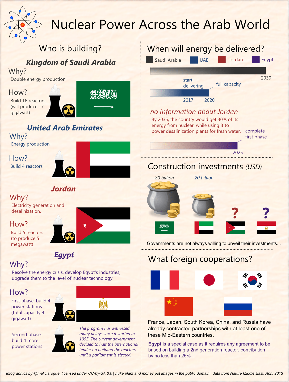
I was feeling like wrapping up a few interesting tidbits I stumbled upon earlier. These are all infographics, some are in Arabic. Enjoy 🙂

Tech

Wamda publishes a nice and comprehensive infographic (full size) summing up the ways Jordanians use the Internet. For Arabic-impared, here are a few highlights:

  • internet penetration in Jordan is only around 48%;
  • of the 1.5 million internet users in Jordan, 90% of women and 87% of men use social networks;
  • the vast majority of internet users are men between 20 and 30 years old;
  • men spend more time on social networks than women (one hour 37 min vs. 50 min, respectively), but streaming websites — amongst the most popular in Jordan — have equal visit rates;
  • Internet users aged above 40 represent 11% of the total number of all internet users in the country.

Internet Use in Jordan, by Y2D and Ipsos.

I have previously written on Jordan (and spoke on radio about it). The most recent piece is here: Jordan Starts Blocking ‘Unlicensed Websites’ (published in Jadaliyya).

Education

I stumbled upon an interesting infographic by the Worldbank, entitled “What Will It Take to Achieve Education for All?”. The infographic doesn’t focus on the Middle East specifically but wraps up global trends. It was published back in April 2013, preparing for the ‘Learning for All’ Ministerial Meeting. The Worldbank Blog published excerpts from the associated social media campaign that I recommed you have a look at.

  • إنفوجرافيك: ما المطلوب لتحقيق هدف التعليم للجميع؟ (full size)
  • “What Will It Take to Achieve Education for All?” (full size)

infographic-educ-ar

I have recently written on more Middle East-targeted education topics: Information Technologies and Education in the Arab World (published in Nature Middle East).

Workplace

Bayt.com, the famous online job search platform, has conducted a poll which saw 9,845 respondents covering the UAE, KSA, Kuwait, Qatar, Oman, Bahrain, Lebanon, Syria, Jordan, Algeria, Egypt, Morocco, and Tunisia. The results are presented in a comprehensive infographic (full size); highlights:

  • 20% of job seekers blame the educational system for being ill-prepared for the current job market;
  • 54% of professionals are active job seekers who apply regularly (vs. 46% who are passive job seekers, that is they wait for employers to find them);
  • 30% of professionals feel the biggest turn-off in a manager is the lack of vision;
  • top industries perceived to be employing the most talent are Oil and Gas, & IT and Telecom.

Workplace Dynamics in MENA

MENA Nukes

Standard

Some time ago, I created the infographic below. It looks at the transparency of nuclear power across the MENA (the Middle East and North Africa) countries.

Now that I have a look at it, it is pretty much Q&D thingy, but the important is there: data is correct, proof-checked and properly introduced. I thus decided to anyway publish it.

Nuclear power in the Middle East. Click to zoom in. Ask me for the .svg source

Data source

Crunching raw stuff: on the road to #dataviz, part 1

Standard

One day, my overcrowded inbox delivered a particular message: an invitation to enroll in a MOOC (Massive Online Open Course) on information graphics and data visualization. This made me pause a bit, for a few reasons. First one is curiosity, of course: I’m obsessively curious, my memory is like a sponge, so anytime I bump into something new, my neurons start jiggling. This happened this time as well: I had never taken a MOOC before, and anyway #dataviz is something I’m quite interested in.

Second is this, precisely: I’m a hardcore scientist, and infographics are generally dismissed as “fancy, glossy and stupid” by a majority of my peers who hail the idea of presenting raw, dry facts which supposedly speak for themselves. Indeed, many infographics I have seen when browsing the web are not far from this pejorative definition as they are just a nicely put brag of a gifted designer but bring no insight whatsoever in the information they are supposed to present you.

Third is that I somehow got into data storytelling, or making big boring numbers relevant for the layman. I know many people — including myself! — who are not keen at all digging into the World Bank Database and reading about GDP or GNI or whatever the eggheads out there have decided to call it. This repulsion is, however, much easier to overcome when you are scientist for the mere reason that a major part of your daylight job is just this: crunching raw boring stuff to make sense of it.

How was I supposed to reconcile my somewhat innate obsession of analysis, of uncovering mechanisms and ‘reverse engineering’ even art pieces — which supposes a great sense of detail and possibly a quite rigid mindset, unwilling to give up on details — with depicting and abstracting this incredibly broad range of information into an infographic? I gave it a try or two on my own. I was not happy, either because I feared it was too heavy on facts (the mechanistic freak was too present) or because in an attempt to make it understandable, it was sloppy (the perfectionist came forward).

Then the course kicked off. And my talespinner-scientist schizophrenia got a breathing space 🙂 This sums it pretty well: “The life of a visual communicator should be one of systematic and exciting intellectual chaos.” This just sounded right to me and for me. The quote is courtesy of Alberto Cairo, our instructor, who does an amazing job introducing things in a progressive and logical fashion. I recommend you follow him on Twitter and/or read his blog as his prolific remarks are really worht the read (and funny).

Continue reading

Egypt’s Constitutional Referendum Results

Standard

[This analysis was first published on Jadaliyya.]

Based on numbers reported by Egyptian media outlets, below is a summary of the constitutional referendum vote results broken down by governorate.

What do these numbers tell us?

  • In two stages of voting, average turnout across governorates was 30%, with Egyptians abroad participation being the most notable outlier with a 41% turnout rate.
  • The only three governorates where the majority of voters elected to reject the draft constitution are Cairo, Gharbiyya, and Menofia.

What do these numbers not tell us?

  • Given that the vast majority of eligible voters (68% or 33,855,564) did not participate in the referendum, we can neither conclude that the majority of the eligible voting population supports the constitution, nor can we conclude that a majority rejects it.
  • Only 16,232,035 or 32% of eligible voters have reportedly cast a vote. It is, therefore, misleading to claim that the silence of the other 68% is reflective of support for one position or another.
Continue reading